Visión Sur started as a group of like minded people who wanted to get a more grounded perspective on political and social issues in the Paraguayan nation. At the beginning they just had this logo and a facebook page.

As time went past and the project started to consolidate they now needed a more professional look and a better presence in social media and the web. The main guidelines were that it not only gets associated with Paraguay but with the whole region, and an overall more serious branding.
Taking that into account this was the result
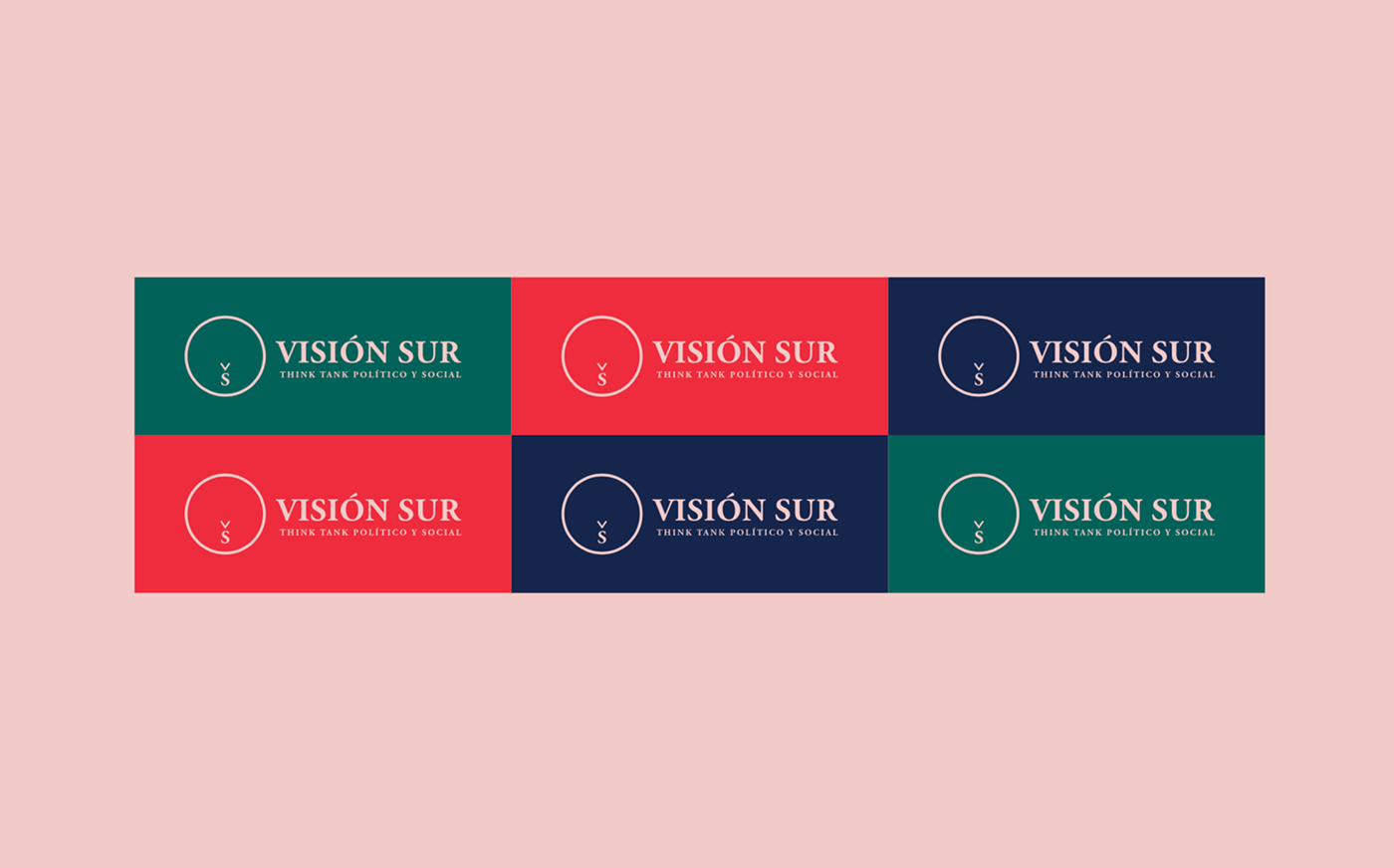
The circle with a down arrow over the S represents two things: 1) a compass that invites the world to also look at South America and 2) South America itself (where it's positioned if the circle is the globe with the Americas at the center). The color palette's intention is to elicit multiple points of view while being cohesive and trying to keep things interesting.
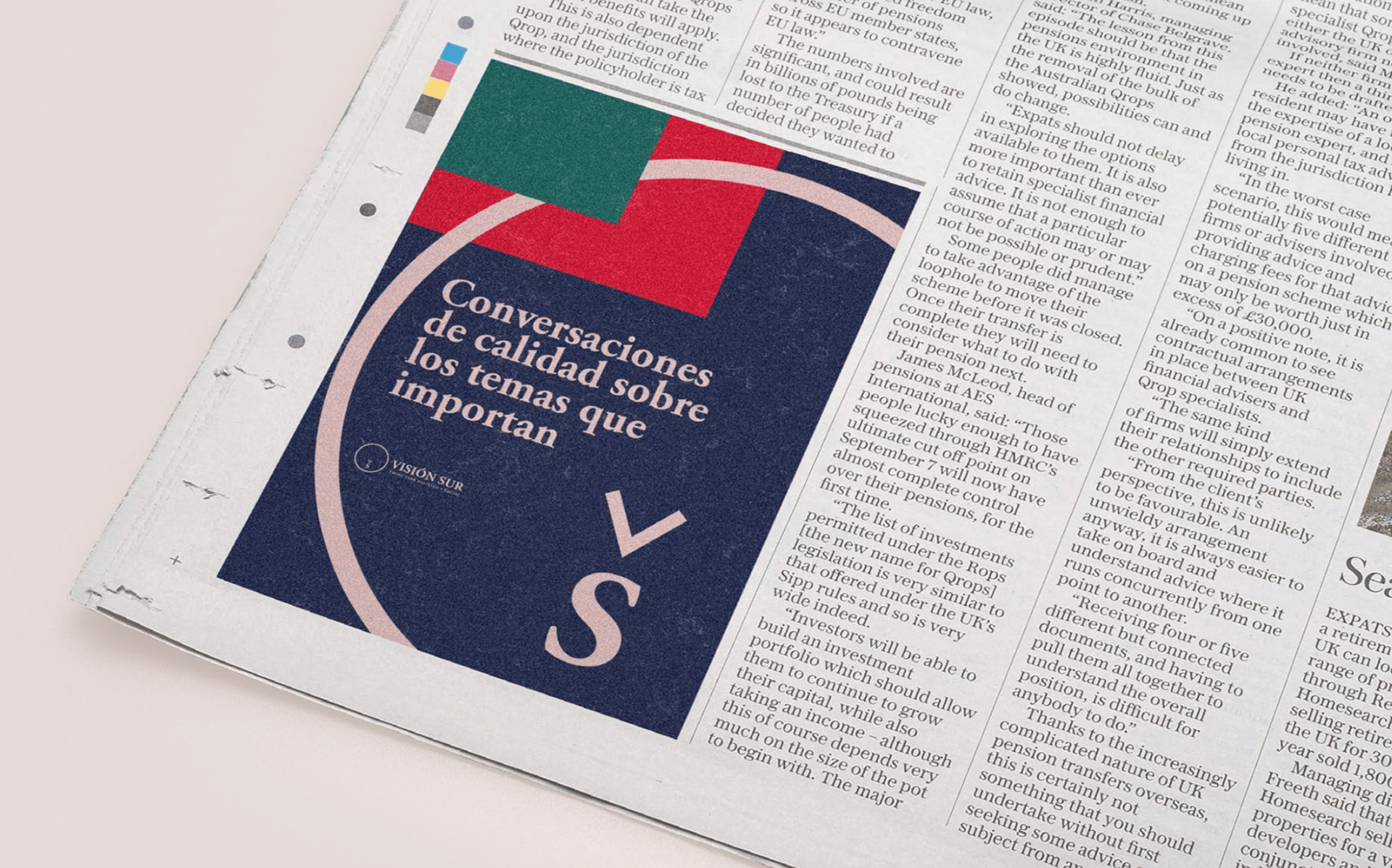
The brand is set up so there are lots of way to integrate graphical elements while maintaining focus on key elements. Avoiding too much noise, and leaving only the essentials.