Prototyping a tool that measures innovation

Project Overview
Inndex is a tool that measures the potential of innovation within organizations. It takes a theoretical framework that analyzes four areas: people, purpose, platforms and processes. The analysis takes information from collaborators of the organization through some short test that are then processed and outputs a report.
My Contributions
I was in charge of building the MVP from the ground up. I used no-code tools, a combination of Google Sheets, Typeform and Zapier. in order to have a quick tool to validate the idea and then proceed to design of the UI for a custom platform.
Description
Jan 2020 - Apr 2020
The biggest challenge of this project was that I'm both the designer and client. Although there is a team behind this project, regarding UX I'm the one taking most of the decisions. This means that my job was to figure out what needs to be designed. I set two priorities at first: 1. Clean the steps a person would make from start to finish for a more streamlined experience and 2. Explore how the report would be shown in a clear way after some data has been collected.

The MVP's User Journey had some unnecessary steps because of the technical limitations it had. Just to name two: The first step while using Inndex is to complete a form with information about the company. When it was completed the user received two separate emails with instructions; and also sharing the test's link with coworkers was a little confusing because it was a default email that wasn't always correctly addressed, especially when it was forwarded by one of the coworkers without giving proper context.

After facilitating some sessions with the rest of the team we could identify some opportunities of improvement and started from there.
A week later I came up with a proposal that tried to eliminate those unnecessary steps in order to have a more streamlined process, and taking advantage of the fact that we no longer have the constraints of the no-code MVP. (This was meant to be developed from the ground up)
Once we decided on some details I started designing each screen, and came up with this.
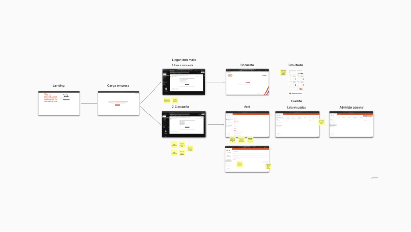
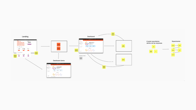
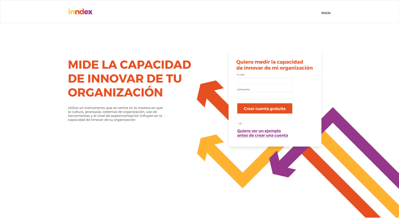
A home page that had a clear CTA (with the option to see a results demo) in order to get started with the test
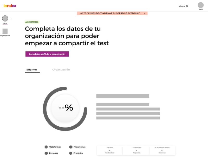
After creating an account the user already has access to the dashboard, that at first is empty with a CTA to fill the organization's info
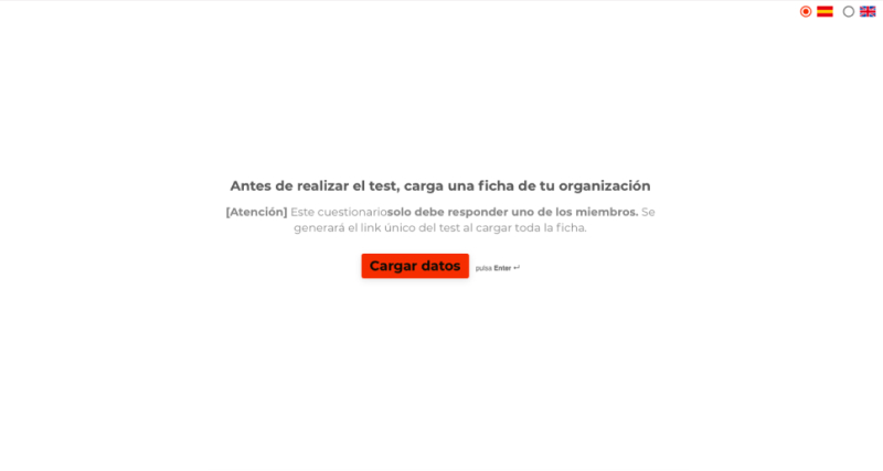
The info is completed through a form (this can eventually be just a profile that can be edited, but for this iteration it made more sense to keep the form)
Now it's time to share the test with coworkers. During our MVP tests we found two ways people seem to prefer doing this: Adding them one by one or sharing a link with them. (I thought that everyone would like to just have a link but it turns out this wasn't true)
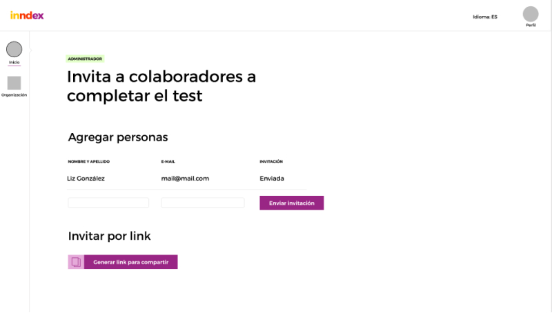
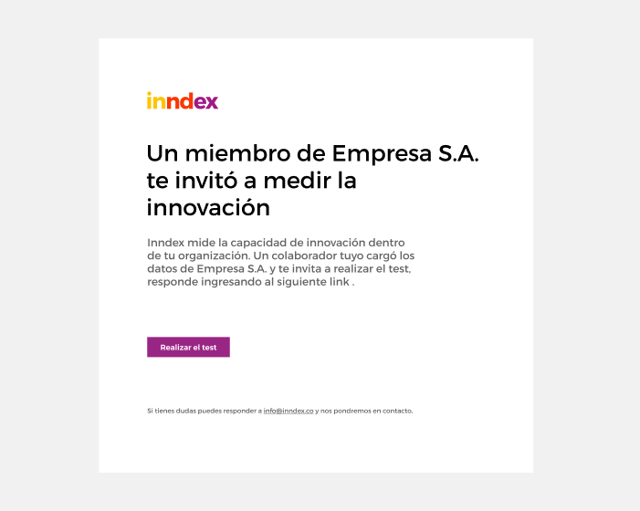
I gave some thought to the email invitation and came up with a short and simple that summarizes to the receiver of the email what's going on.
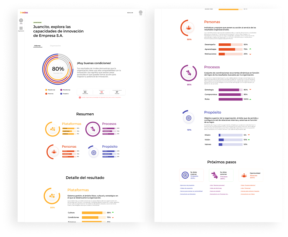
And finally the report. It consists of three parts: A summary at the top, the details of each area in the middle, and at the bottom some suggestions of next steps. It looks pretty straightforward but getting there was a challenge. I don't want to get too much into it because it enters in that theory I mentioned at the beginning and it may get a little messy.

And that's it! This process proved to be a really nice experience of designing a product from beginning to end. Although it's never finished I think this first version came up pretty good and hope to keep improving on it.

More projects

Want to work together?