Refreshing the UI of a scheduling app
Project Overview
Aruba is a beauty service platform that helps connect professionals of the cosmetics and well being industry to new customers.
What they needed
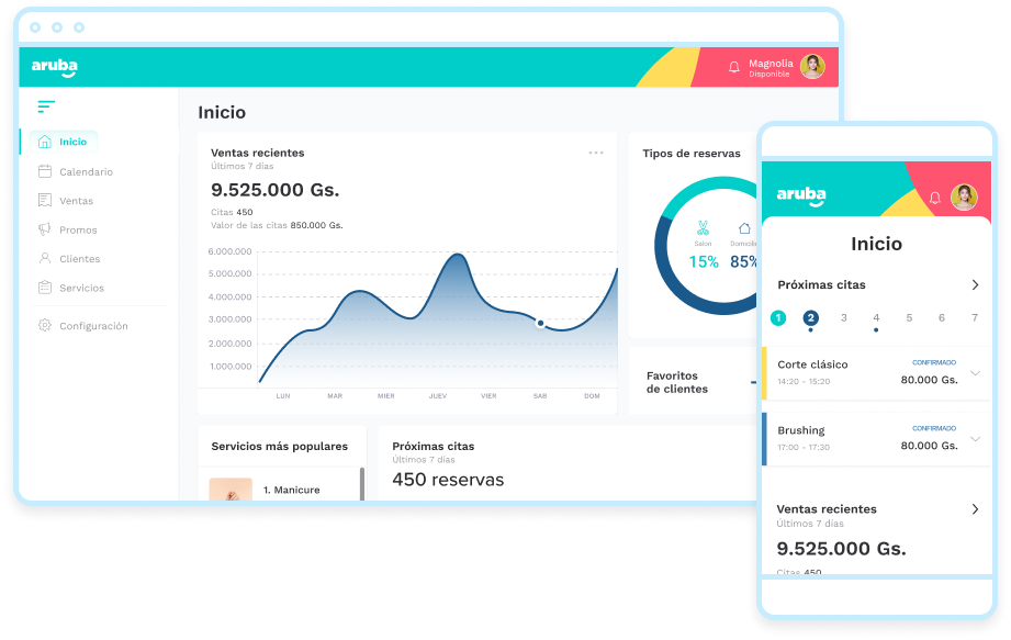
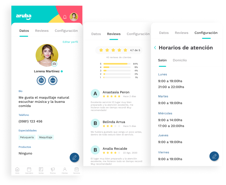
They had an initial design of a dashboard meant for the professionals to use and track clients being managed through Aruba, but it wasn't fully finished, and on top of that they had just updated their branding.The goal was to have a complete and refreshed version of the dashboard that was optimized for mobile devices.This was done as a freelancer project and due to budget and time constraints there wasn't an opportunity to perform a lot of research in the process.
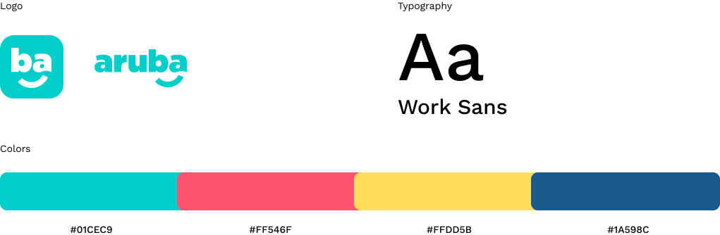
New brand guidelines
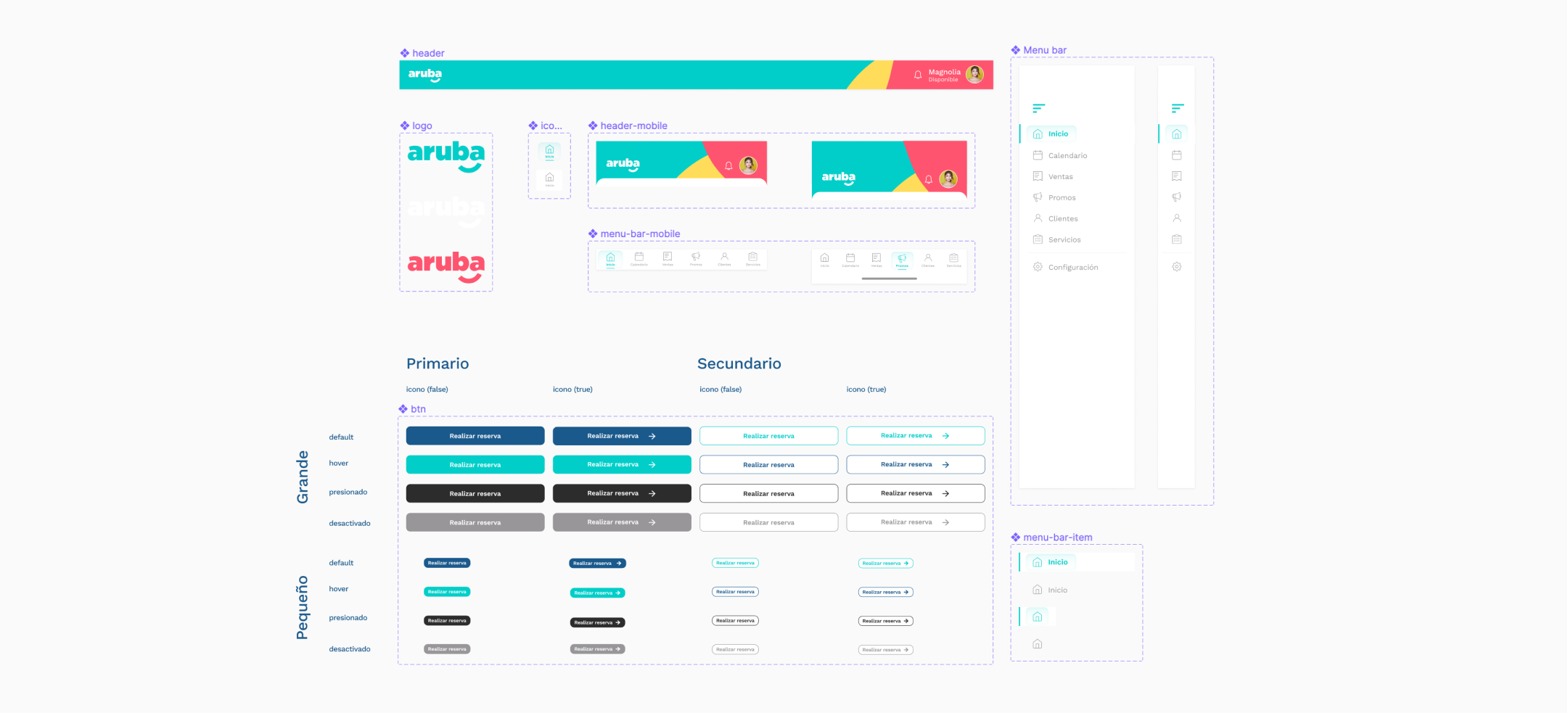
One of my goals was to make the update in a way that they could later reuse some of the components and kickstart their design system.
Building a small design system
Following their new brand guidelines I tried to use the colors in a way that made sense for what each section was designed to do. Although I didn't made interviews myself I relied heavily on information the founders gathered directly from the users.
There were a lot of iterations in some of the more tricky sections, where I had to balance between bringing detailed information and what the user's would value the most and/or use more frequently.Some of the decisions were based on assumptions that needed to be tested, something I let the client know so they can monitor how the app is used.