Setting the scope
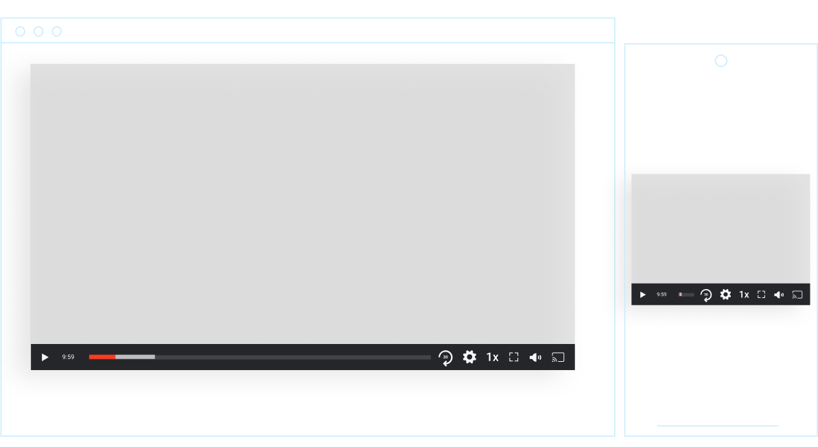
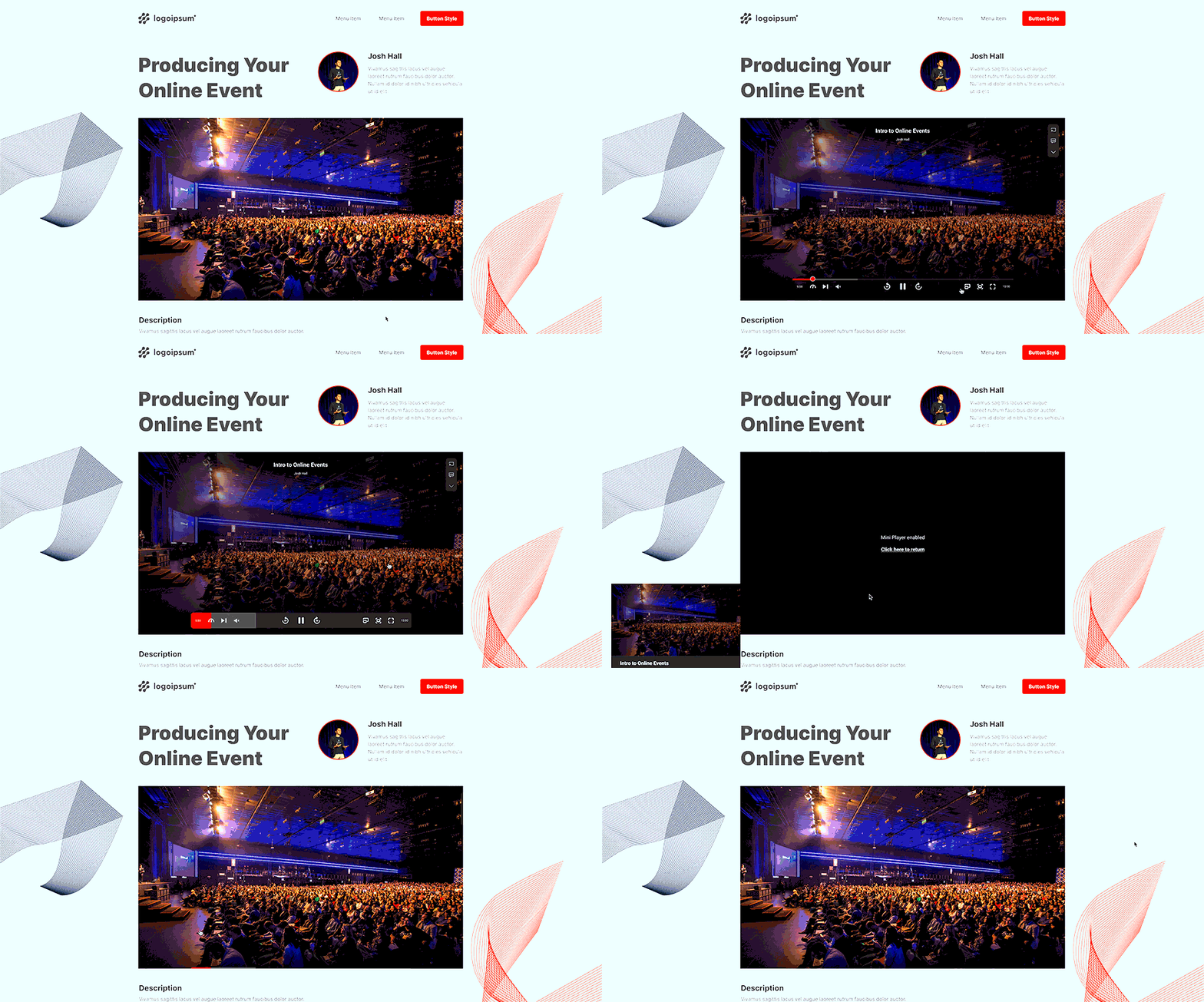
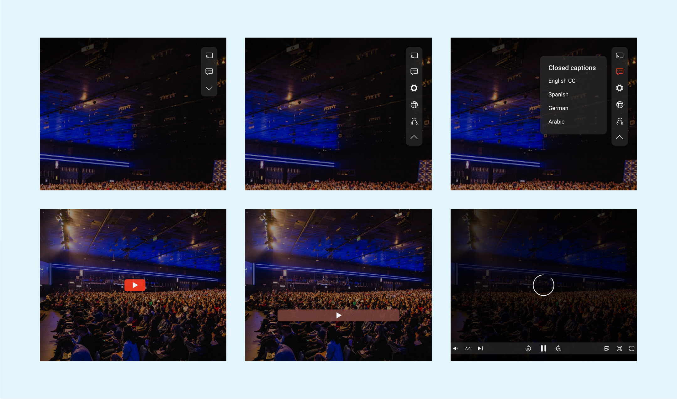
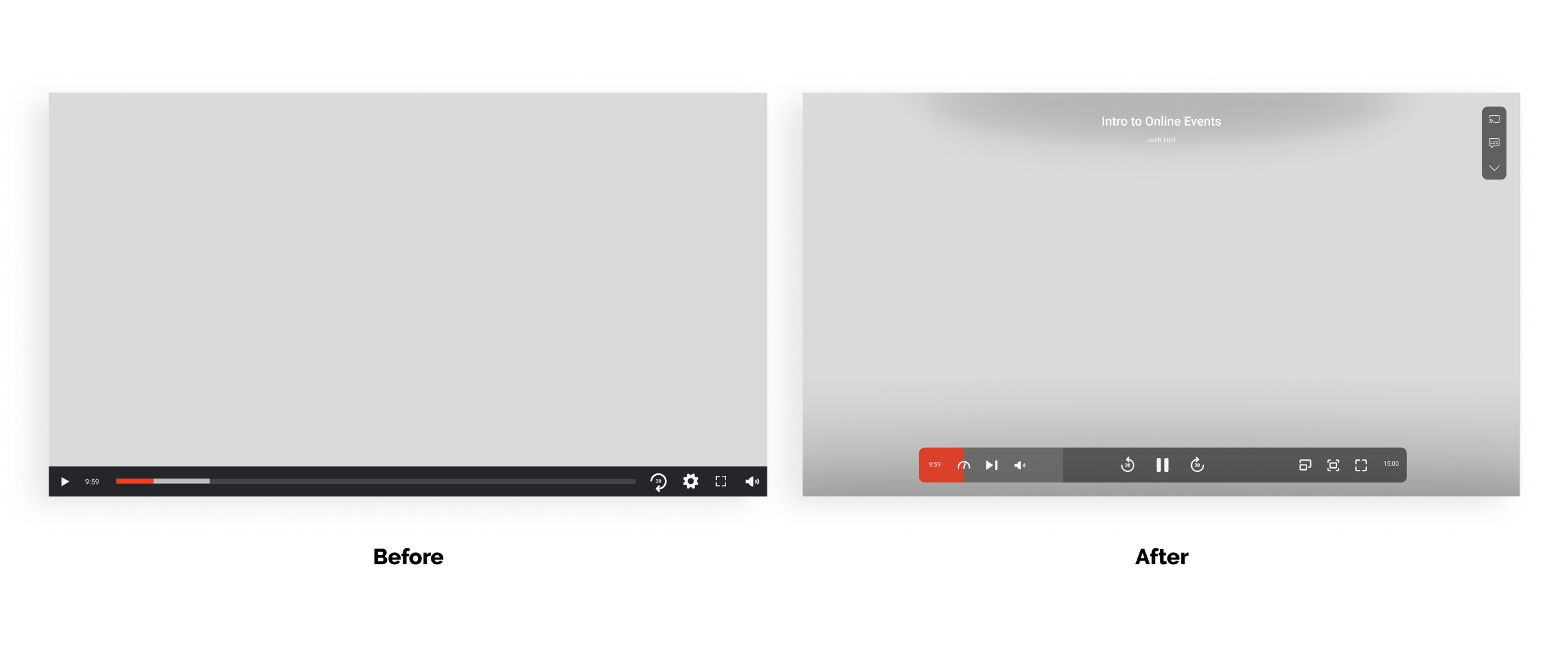
The first thing was getting an understanding of what was expected from the redesign. The UI worked fine when there weren’t many options users could adjust, but as we added more features like languages, playback speed, bitrate, subtitles, casting, and so on, the layout really didn’t adapt to it well. Specially on mobile.

The video player is at the heart of any video solutions company. It should not only reflect the reliability and common functions users expect from it when watching any video but it also should have a unique look and feel. One should be able to recognize a Sardius Player the minute it sees it.
On top of that, we wanted to make sure that the player also adapts to the type of video it’s being watched, wether that’s a live event, a video library or a short clip. Same for if it’s being watched either on desktop, mobile or tablets.
Research
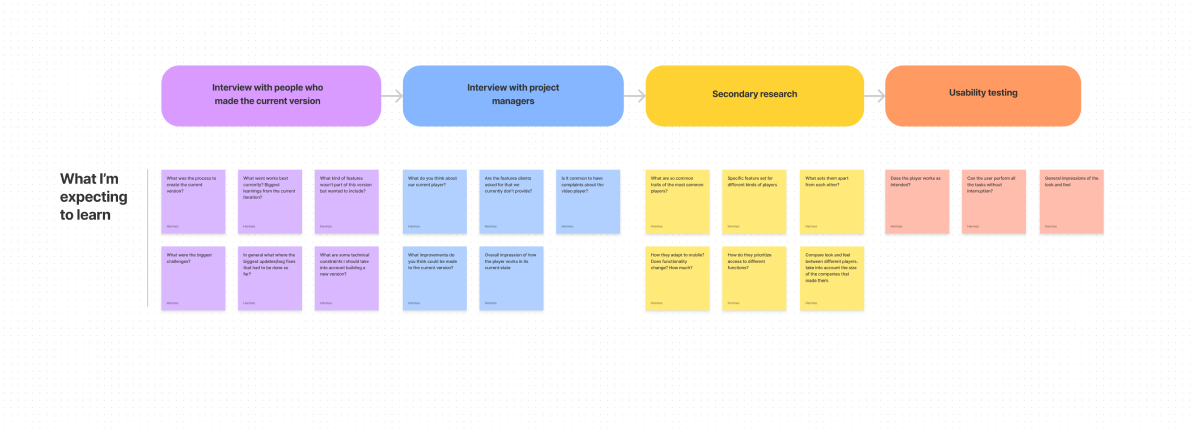
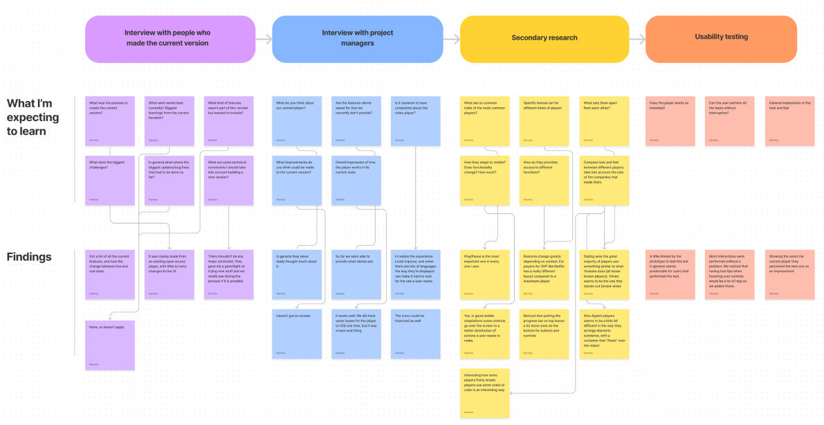
The research phase consisted on two main elements:
Gather information through interviews with:
People who made the current version of the player. Understand the thought process, what was the drive at the moment, what worked well and what needed to be improve from their experience. Also know about any technical constraints I should be aware of.
Project managers. They have the closest relationship with clients. Get an understanding of the general feeling towards the player from clients. Find out if there were repetitive feedback regarding any of the functionality.
Clients directly. Conduct usability testing with a hi-fi prototype
Competition analysis:
Youtube as the standard
Netflix and Disney plus for video library
Quicktime and Vimeo for uniqueness
Documentation of open source solutions and UX case studies

Findings
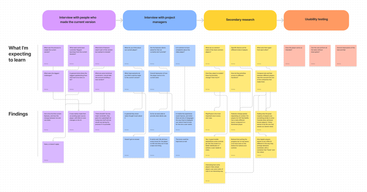
Talking with the people involved with the current version of the player I found out it was mostly a re work from an open source video player with very few tweaks of the UI. Improvements were aimed mostly at some technical needs that improved its performance for streaming video.
Reading the documentation of that “source” player actually led me to change a little bit the order of my research plan. I started reading about other players as well. Clearly there are some gold standards and the changes for different use cases started to became apparent.
I asked myself what was specific about our use cases that may help us differentiate from other platforms. By the time I met with the PMs I had questions based on what I’ve learned so far. From my conversations with them I concluded we should prioritize two use cases: live events and video library.
For live streaming the user ideally interacts a lot less with the player itself, meanwhile users watching a video on demand can change the playback speed, the quality of the video, move forward or to the next video, that is to say, interacts way more with the player.
Also learned about some specific scenarios like for example some events need tens of different languages to choose from, and our current UI really didn’t work well for those cases.

With the information I gathered I put together some really lo fi wireframes to discuss with the product owner and the developer some basic ideas. I also took this phase as an opportunity to get a better understanding of any technical constraints I should be aware of.
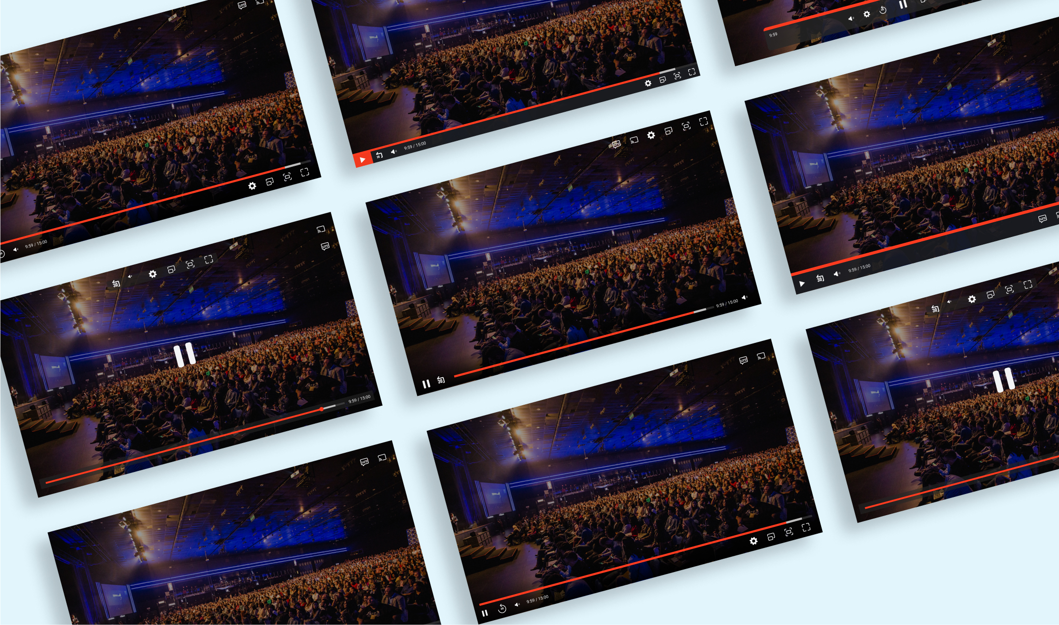
Then I started brainstorming on different ideas.
