Redesign of the sidebar chat for Online Events

Project Overview
I was tasked with the redesign of the chat feature for Sardius's online events. As part of a larger platform redesign effort, the chat represented a significant opportunity to improve the interactive experience for attendees. Throughout the process, I relied on user research, competitive analysis, and collaboration with developers to guide my decisions. Despite encountering some challenges along the way, I am proud of the final result and believe it demonstrates my growth as a product designer. The redesigned chat serves as a cornerstone for future improvements to the platform, and I am excited to see it in action during live events.
My Contributions
Conducted user research through interviews, competitive analysis and past debriefs
Catalogued user feedback on the chat and listed areas for improvement
Worked on the information architecture to arrange chat features in a logical manner
Settled on chat design solutions such as chat bubbles, smooth and delightful message reactions, and default emoji appearances
Tested the high-fidelity prototype with real users and made adjustments based on feedback
Contributed to the overall success of the project and growth as a product designer, with the chat serving as a key component of the attendees' online experience.
Description

Setting the scope

We kicked off the redesign with a research plan that aimed to understand the needs and wants of our users. We chatted with real people, scoped out the competition, and after conversations with the dev team, we realized that a phased approach was the way to go. So, we broke down the redesign into manageable chunks, making sure that every phase worked correctly with the rest of the platform and making bugs easier to catch and fix.

Research

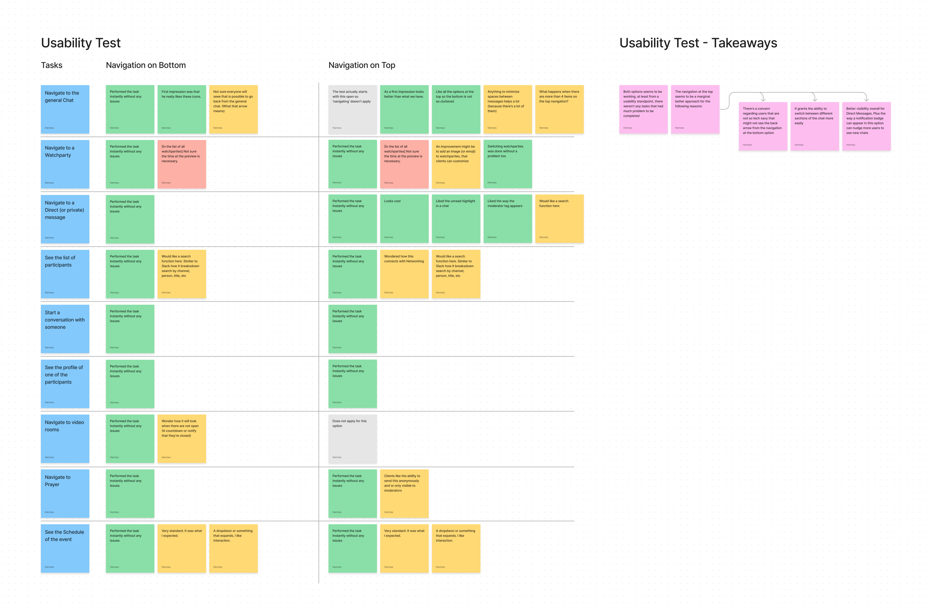
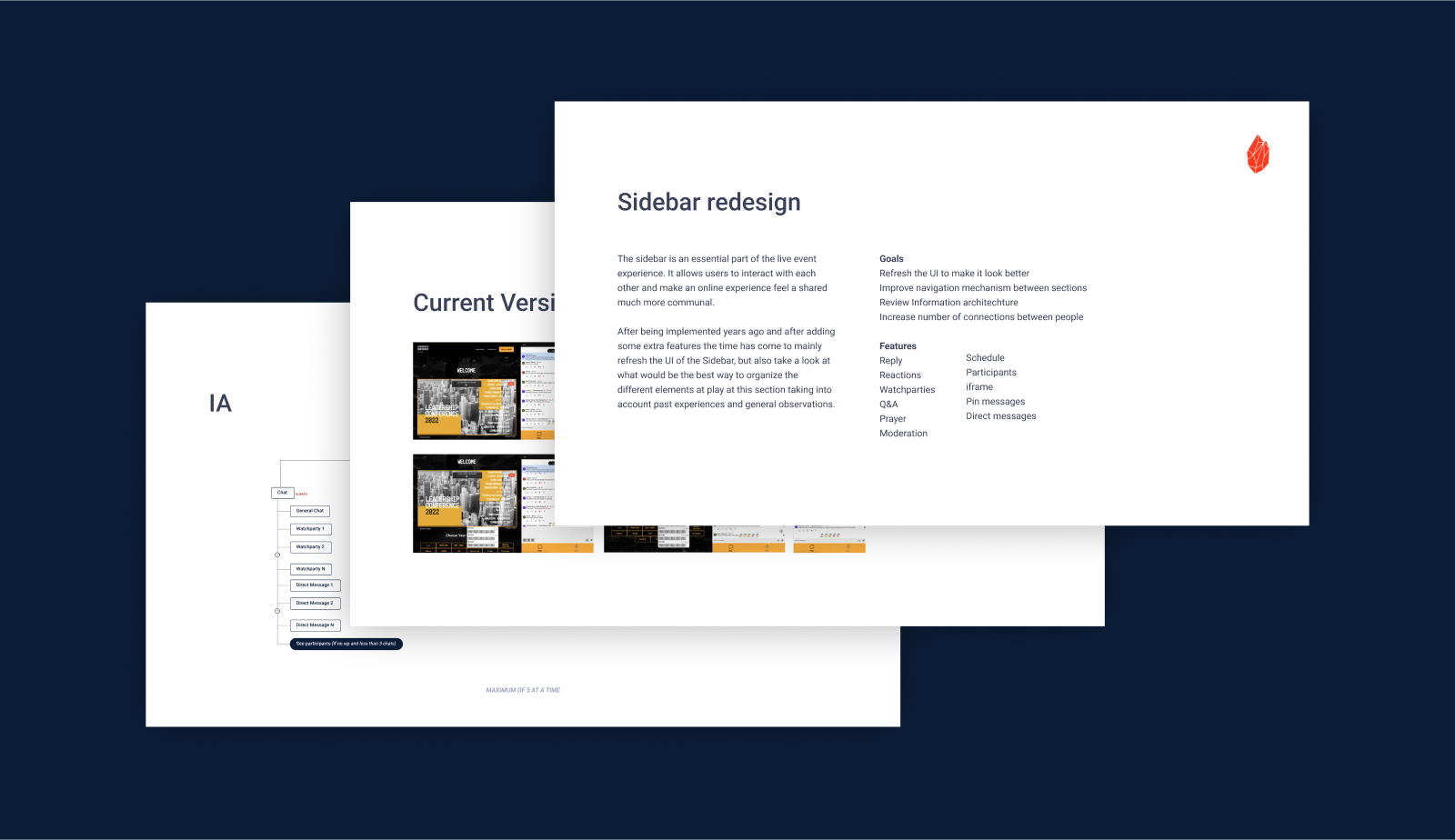
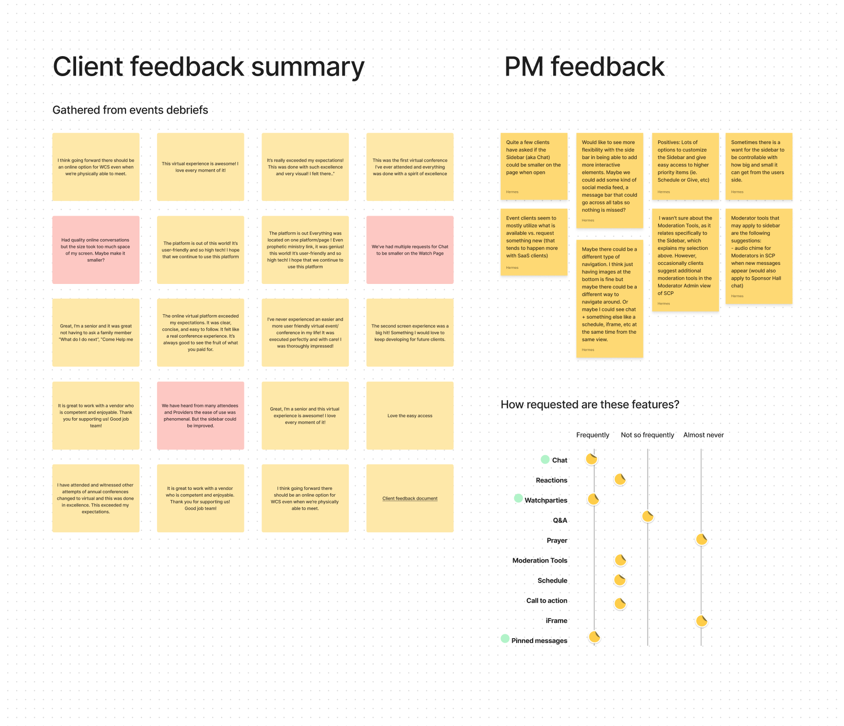
The research phase of the project relied heavily on input from our internal user base, including project managers, to gain insights into their experiences and pain points. We also conducted an extensive review of past online event debriefs and analyzed every mention of the chat sidebar. This information was cataloged as either positive or negative and used to create a list of areas for improvement. By taking a data-driven approach and considering the perspectives of both our internal and external users, we were able to identify key areas for enhancement and prioritize our efforts accordingly.

Findings

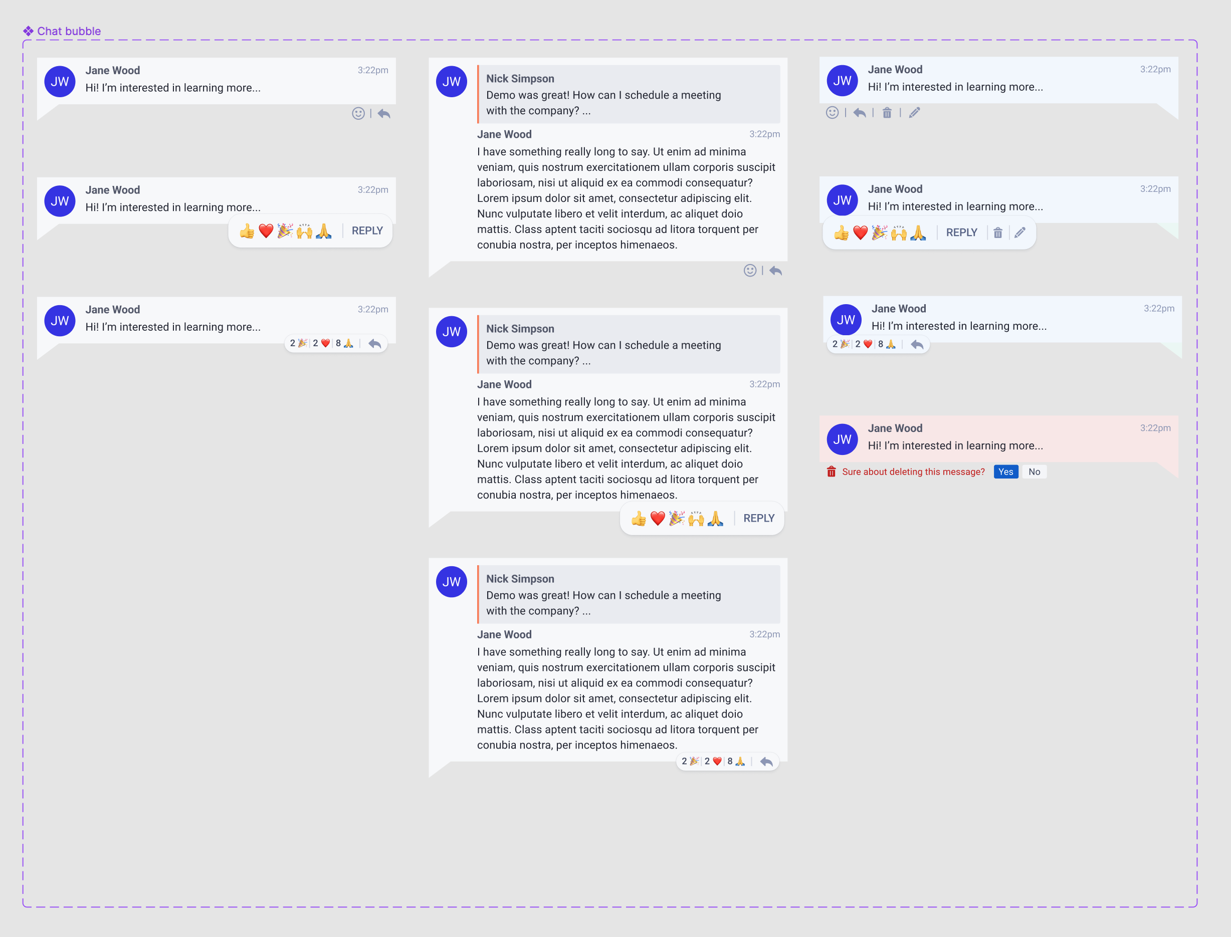
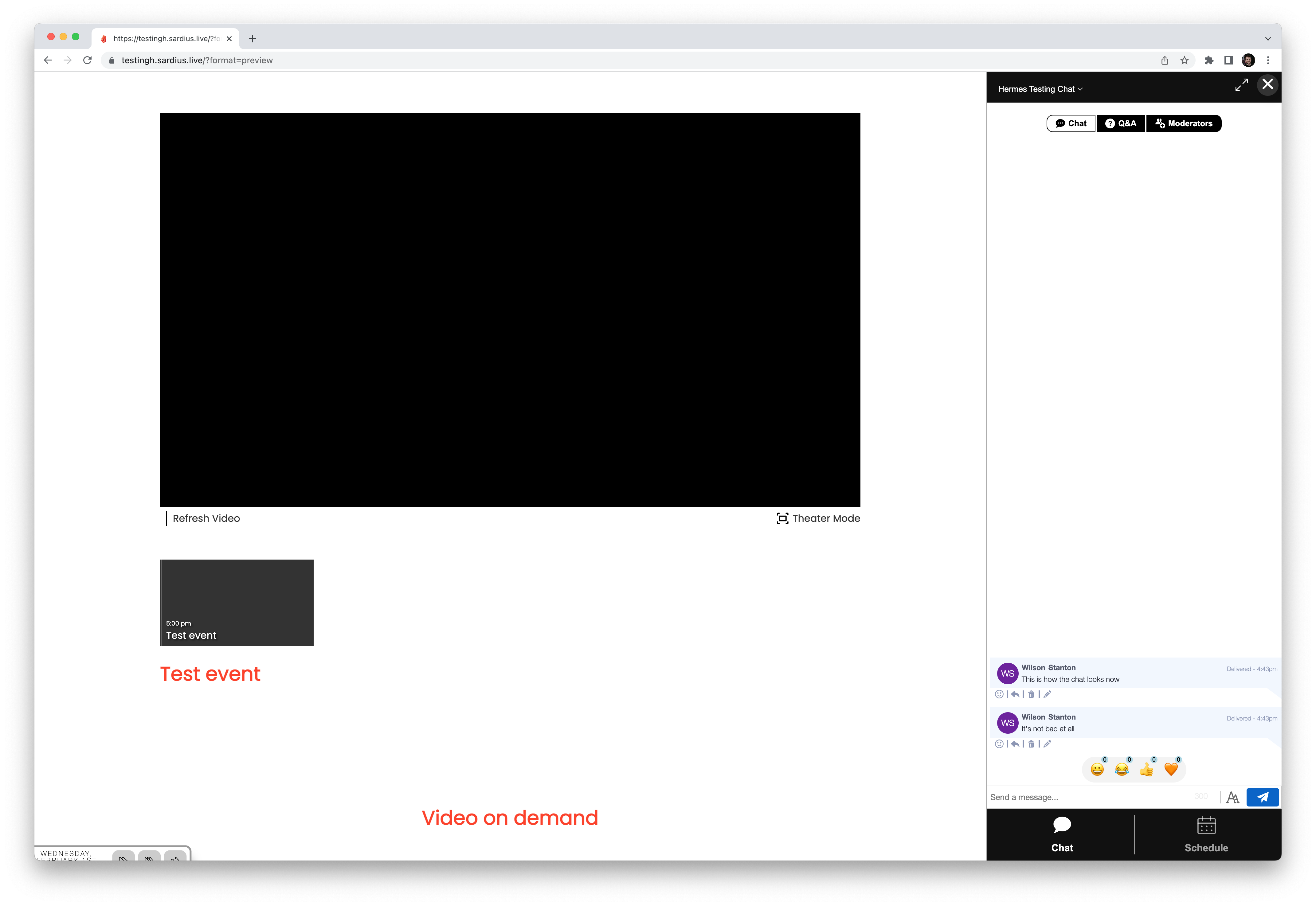
The findings from our research showed that the size of the chat sidebar was a common issue among users, with many feeling that it was too large. Additionally, the chat's appearance on mobile devices was a point of frustration for some users. Although no one expressed outright dislike for the chat, it was clear that the design felt outdated.
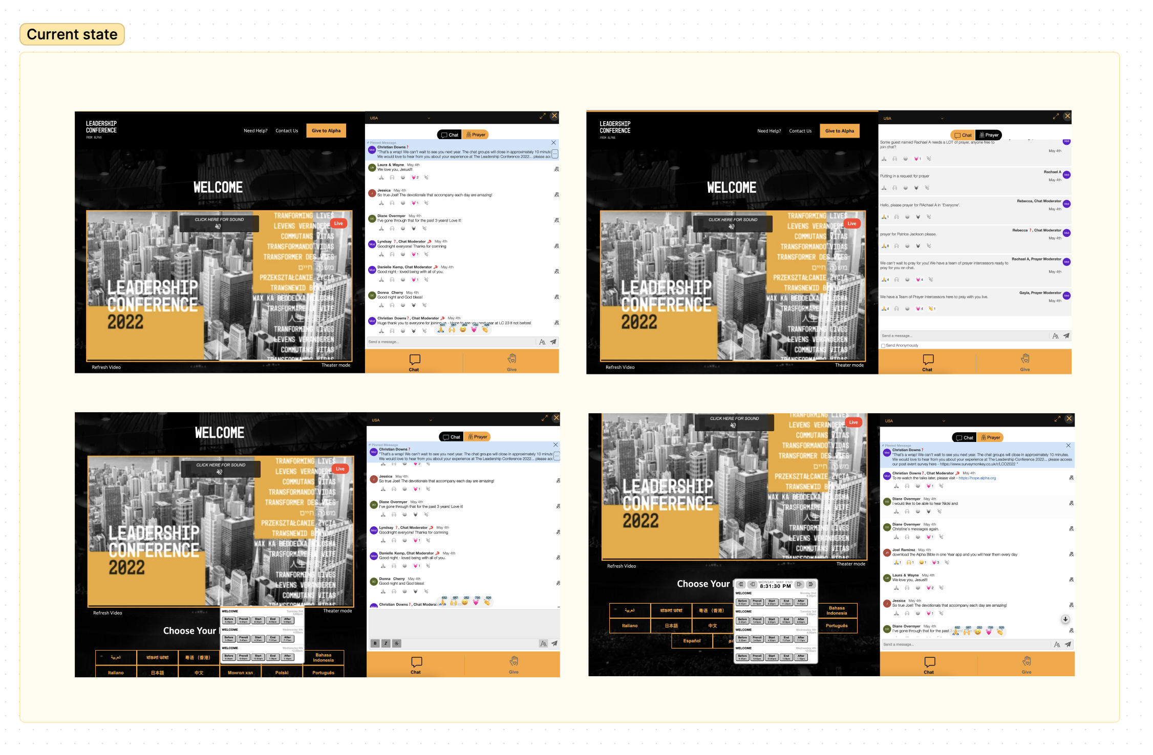
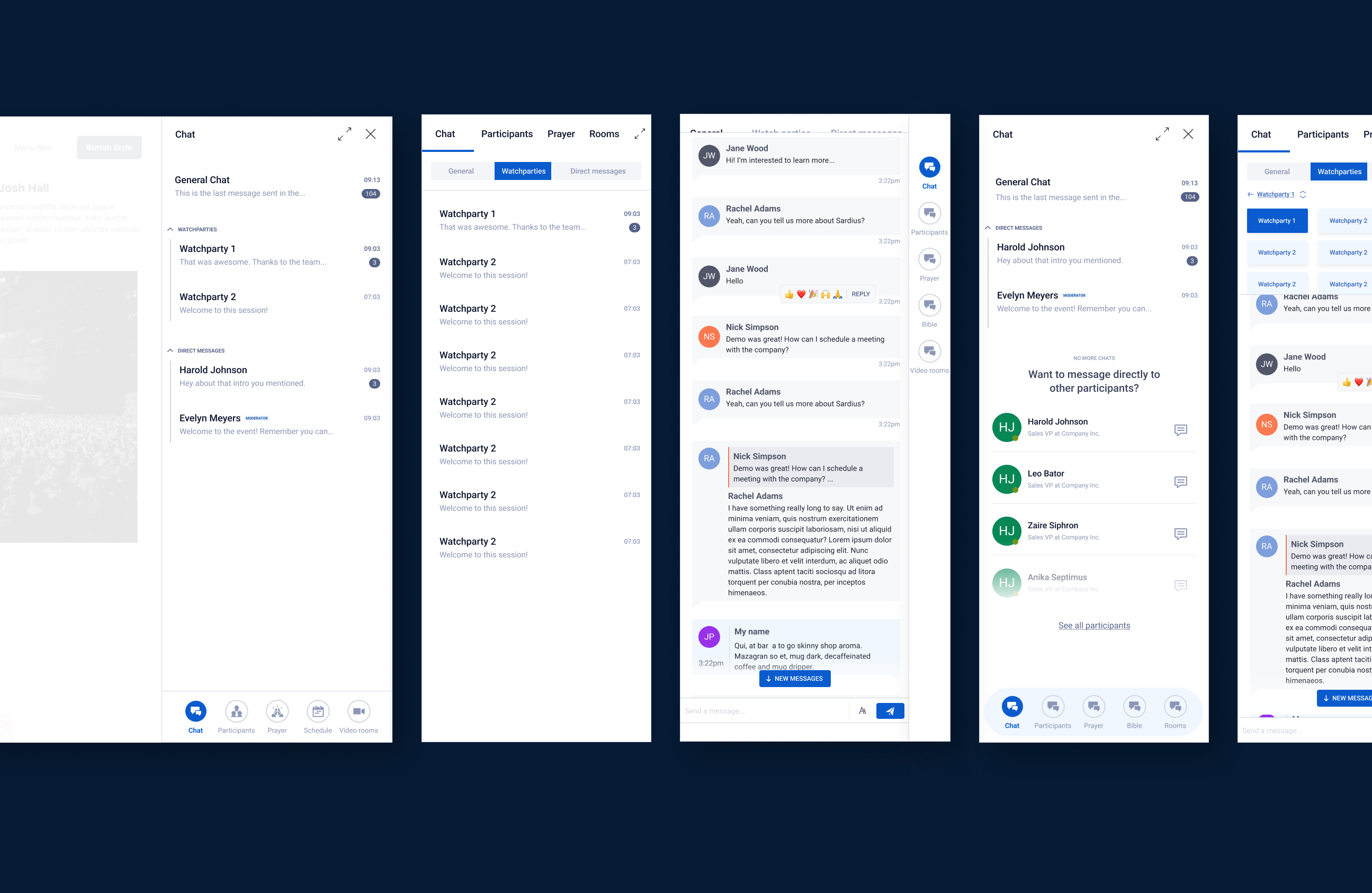
We focused on improving the information architecture of the chat sidebar, ensuring that its features were arranged in a way that made the most sense for our users. The sidebar included a range of functionality, including a Q&A tab, polls, direct messages, video rooms, access to the event schedule, an iframe embed, and the ability to donate to the event. Our goal was to create a user-friendly and intuitive layout that made it easy for people to access and use all of these features.
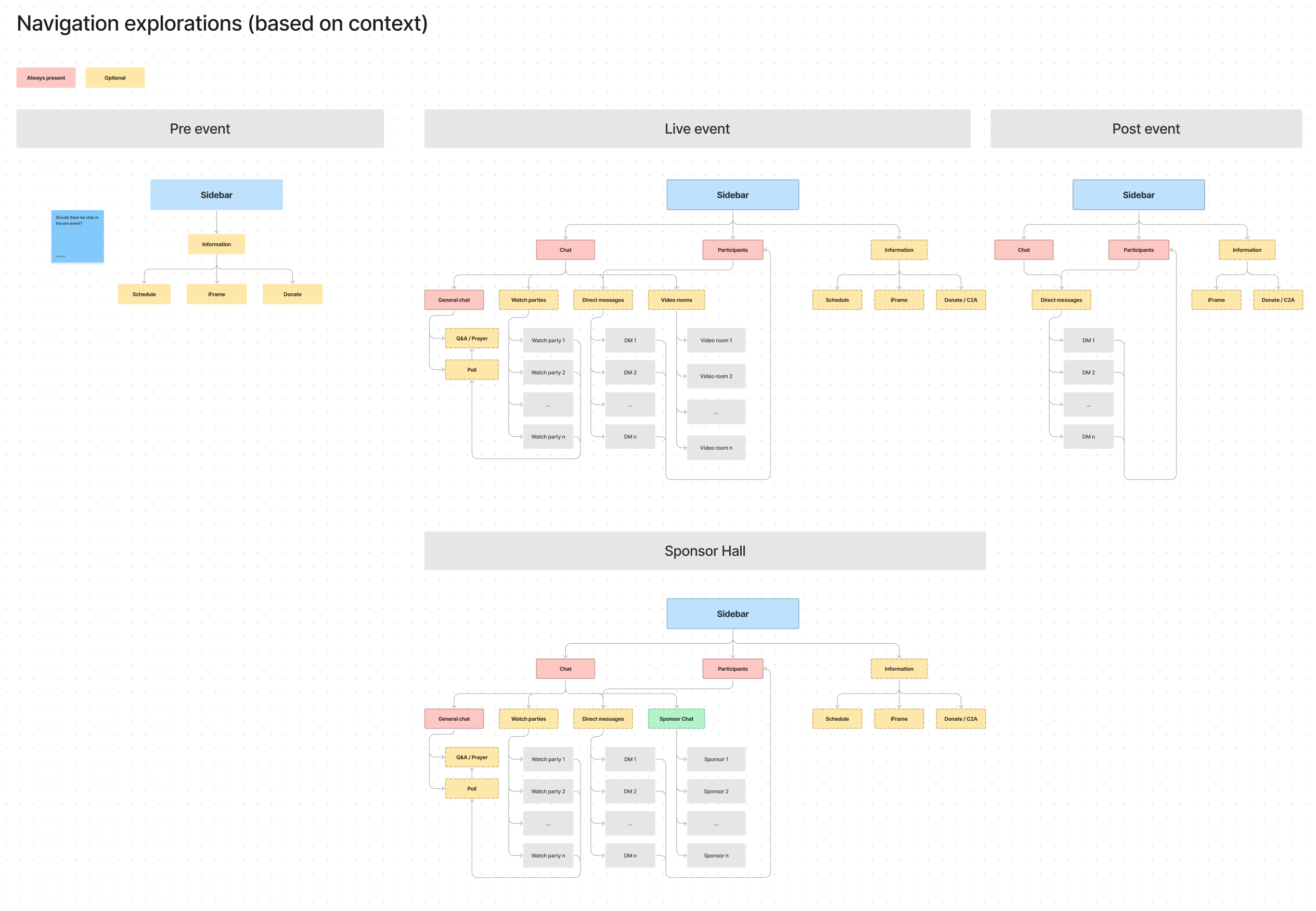
Based on these considerations, we decided to set the scope for phase 1 of the redesign project to focus solely on the chat. Our objective was to ensure that the chat was stable and functional, with any bugs or issues being easily addressed. By limiting the scope to the chat in this initial phase, we were able to minimize the risk of introducing new problems while still making meaningful improvements for our users.

Explorations

During the exploration phase, we embraced a mindset of creativity and experimentation. We tried out various design approaches and layouts, not being afraid to take risks and try new things. As we worked to identify the best solution for our users, any options that did not meet our goals or improve the user experience were discarded.
We settled on several key design elements that improved the chat experience for our users. One of these was the use of chat bubbles to contain messages, which helped to reduce the amount of padding between messages and allow for more messages to be displayed in a single view. This was particularly important in high-interaction events, where it can be easy to lose track of the chat messages. By providing clear differentiation between messages, we aimed to help users keep up with the conversation and stay engaged with the event.
Another key aspect of the exploration phase was refining the way that users could interact with messages in the chat. We focused on creating smooth and delightful interactions that were both functional and aesthetically pleasing, without being distracting. During this process, we also decided to include default emoji reactions to messages, as this was a client-facing feature that could be left empty, which had a negative impact on the appearance of the chat. By carefully considering these details, we aimed to create a chat experience that was both functional and visually appealing for our users.

Testing

In the testing phase, we created a high-fidelity prototype on Figma of the chat redesign and solicited feedback from real users. While the overall reception of the new changes was positive, we did identify some areas for improvement, such as adjusting the sizes of certain elements and refining the flow for actions such as deleting a message.
It is worth mentioning that during testing, we encountered some limitations with the prototype, particularly in emulating high-interaction events where a large number of messages could be generated on a short time during an online session. To overcome these limitations, I attempted to create a version of the prototype using HTML and CSS on Codepen. However, this proved to be more challenging than expected and, as a result, we created a version that allowed testers to input messages, and we automated some responses to provide a more realistic experience. This not only allowed us to simulate more real interactions, but it also helped the development team to implement the design more efficiently, as some of the code was already in place.

Implementation

With the testing phase complete, it was time to move on to implementation. After a series of design reviews, we arrived at a more polished version of the chat. The end result retained the familiar feel of the original chat, but with a modern update that made user flows such as replying to messages, editing, and deleting them much easier. The final product was well received and met the needs of the user base.

Final thoughts

In conclusion, this was a challenging project that required us to be flexible and adapt our plans along the way. Despite its challenges, the end result was highly rewarding. The new and improved chat was a success, making a positive contribution to the attendees' online experience.
Disclaimer: As an experiment I used ChatGPT to help me write this case study. Rest assured everything mentioned was actually part of the process and later edited (If you are interested here is the unedited version).

More projects

Want to work together?