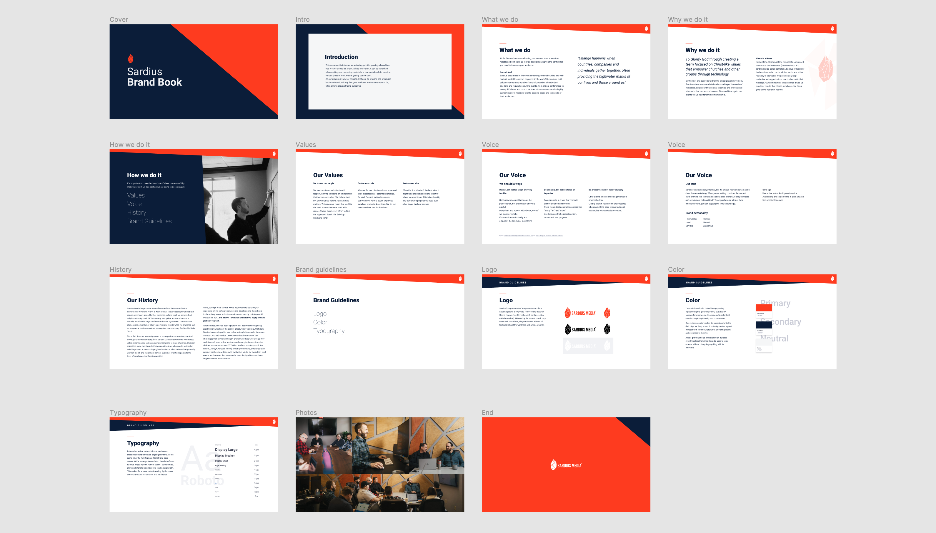
Building the foundations of the brand
The identity, values and voice of the brand was pretty clear for the founders and most of the members with more time at the company. It just wasn’t explicitly laid out anywhere in a way team members could use as a guide whenever they needed to.
During the first weeks of induction I noticed this so the first thing I did was a really simple brand book where I collected all of the main elements of the brand in a slide deck people can refer to when writing copy, making marketing materials or even as a part of the induction process for new hires.
I consider it was a low hanging fruit and a quick way of starting to add value to the company right from the start.
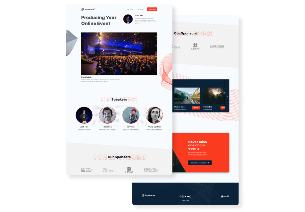
Designing a layout to be re used as the basic plan
In the company’s transition from building custom sites for each client to focusing on becoming a SaaS company we needed a template that would have some basic functionality and that could serve as an entry level plan for small clients. Giving them a taste of what was possible with us with just the basic level of our features and then potentially getting them to up their plan with more features.
The design process was pretty straightforward, since most of the functionality was already proven with many clients in the past, the main focus was on making it look good for clients that only had a logo and maybe some colors as branding assets. Giving this template a lot of constraints was by design.
Started with some wireframes to get everyone on the same page as to what were the features we wanted to include in this template. Then started iterating on the design. Even though we wanted to keep what was changeable really limited, I needed to approach this design as a template, so had to keep in mind what changes the users are going to be able to make. This prove to be challenging specially when thinking about colors. The more colors were available to change the more the chances the don’t work right together. After all, this was meant for clients without many branding assets, so it was safe to assume that they may not have a designer putting the site together. I decided the best way was to just give two colors as the ones a user could change. And then dynamically change the rest using a JavaScript library that could then extrapolate a darker and lighter color from those, and then some global colors for everyone that includes black, white and a neutral grey one. Having those building blocks agreed upon this was the final design.
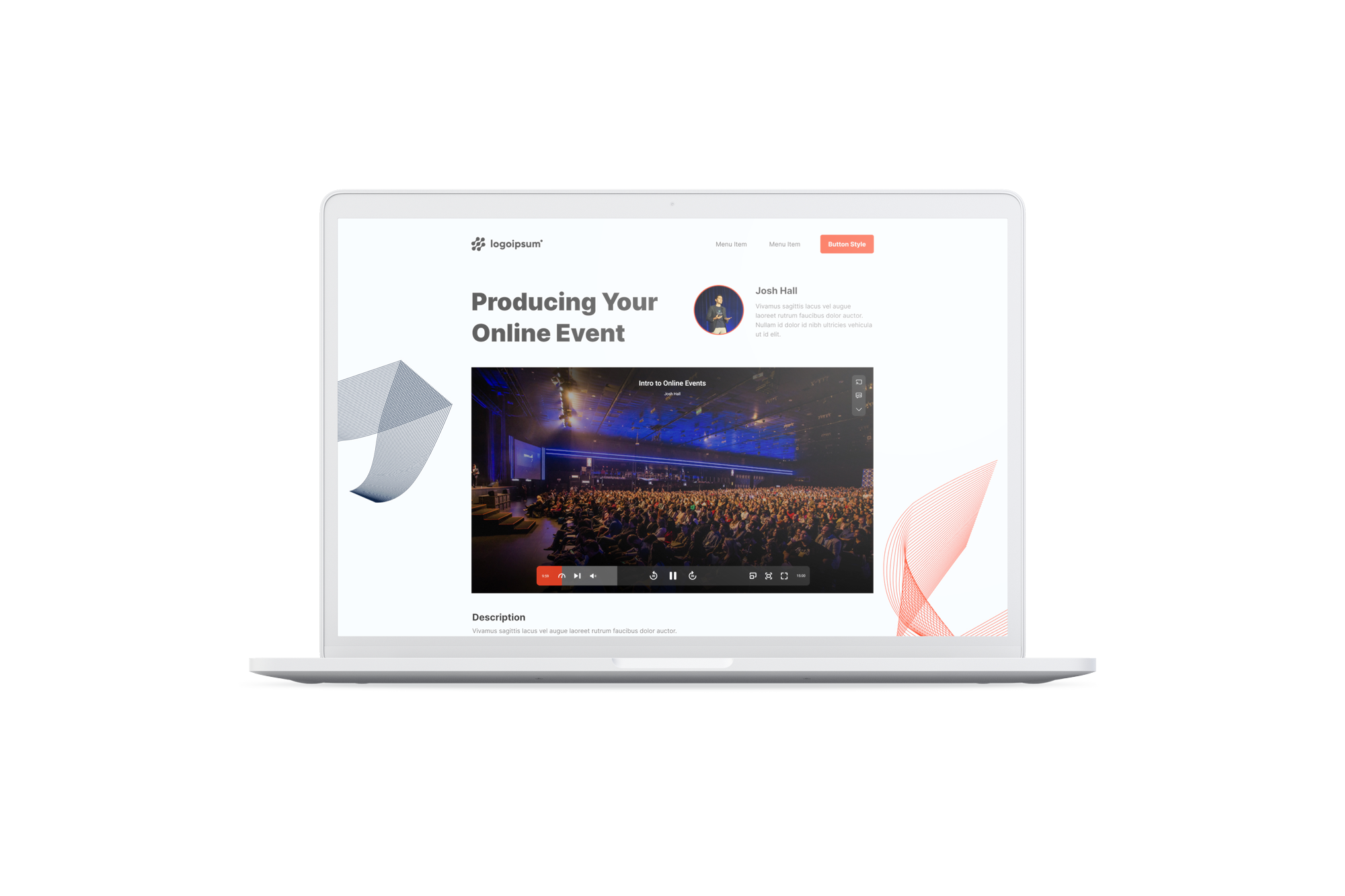
Redesigning the video player with branding and usability in mind
In my opinion the video player is at the heart of any video solutions company. It should not only reflect the reliability and common functions users expect from it when watching any video but also it should have a unique look and feel. It should also adapt to the type of video it’s being watched, wether that’s a live event, a video library or a short clip on a phone.
That was the main goal I had when an opportunity to rework on the UI of the video player came around and became really excited about it.
The design approach for this project was to sit on the shoulder of giants. Study the biggest companies related to video and understand their decisions in order to come up with best practices for each scenario.
This is how I categorize them:
Youtube as the standard
Netflix and Disney plus for video library
Quicktime and Vimeo for uniqueness
I extracted some learnings from each one and began with some wireframes to have an understanding of any technical constraints I should be aware of and sharing some initial ideas. After it was a process of trying different things and finally decide on one.
Then it was time to go into the weeds with all the functionalities we wanted to have so I made a prototype to not only see all the different screens but also get a feel of how they should interact. Video is inherently dynamic, so the player shouldn’t be static. I wanted to make sure every transition was clear and intentional. It was challenging but at the end I was pretty proud of that prototype.
Time to make some tests. I had 5 interviews where I shared the prototype with some users and gathered feedback. Some icons weren’t working all that well and some sizes for buttons needed to be adjusted. Overall the reception was positive, it felt like polishing some details. At least at this stage. After presenting the results to the product owner it was decided to move forward with the development and make some more test with a functioning version.
The player is still being developed but I’m really happy with who this turned out so far. I believe it has a personality of its own and can’t wait to see it on every client’s event pages.